Stockholm UI Manager Module
Introduction
The Stockholm module empowers the creation of UI elements and animated components within the same category, ensuring ease of use and, ideally, error-free implementation. While we acknowledge that developers have their preferred methodologies, we highly recommend utilizing the Stockholm UI Manager for the creation and management of Game User Interface. It operates independently of other core modules, fostering an efficient approach to UI development.
How to Install
-
Import the Stockholm proxy module from the Package Manager UI.
-
This module has dependencies on certain utility modules, and they will be automatically loaded alongside this module.
-
And finally Odin Inspector has to be installed in Unity.
That's it.
The Structure
To employ the Stockholm module, a singleton UI Manager is required, referencing a Stockholm component in the initial scene. Simply put, this component is equipped to load (mount) a designated UI prefab and subsequently destroy (unmount) it when it is no longer needed. Further details about the contents of Stockholm.cs can be found in subsequent sections.
In every UI unit, we emulate an MVC framework. Within this framework, we oversee the UI through Controller components linked with each View and Model.
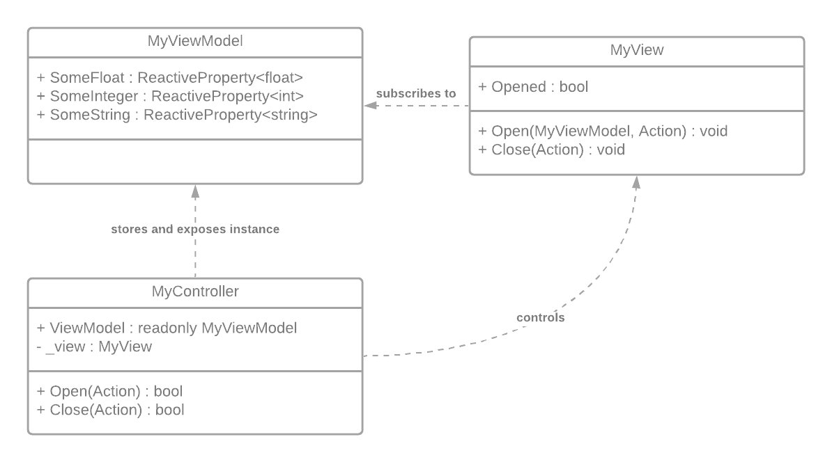
Let's call a complete UI unit a User Control.
-
This User Control must include a
Controllercomponent, enabling the execution of methods for loading, opening, closing, and ultimately destroying it. -
The inclusion of the
Viewcomponent is essential if we intend to animate the User Control during opening and closing, or whenever there is any visual element in the UI. -
The utilization of the
Modelserves to segregate gameplay parameters from the controller script, fostering a more organized structure. This separation proves especially beneficial for tasks like handling localization, remote configuration in a more streamlined and efficient manner.
We are ideally trying to provide complete components ready and easy to implement for a structured development, and it works best when these three components work together. Every user control unit needs to have exactly one Controller component, and ideally one View component and a Model class. Additionally single User Control can have lots of sub-views controlled by this parent controller. Since View component is a script to be used to animate a certain UI item, it is actually expected to be attached to sub-UI items without a controller attached to those same items.
Stockholm Configuration
In API, we included some string based configurations inside StockholmConfig file, which can be accessed through Matchingham > Stockholm > Config. It is a scriptable object created inside Resources file, and it can be updated in inspector window.
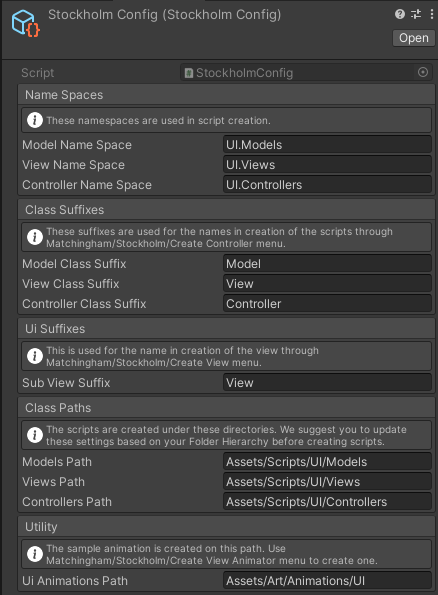
- Name Spaces: The namespaces which are used in script creation.
- Class Suffixes: These suffixes are used for the names in creation of the scripts through
Matchingham > Stockholm > Create Controllermenu. - UI Suffixes (Sub View Suffix): This is used for the name in creation of the view through
Matchingham > Stockholm > Create Viewmenu. - Class Paths: The scripts are created under these directories. We suggest you to update these settings based on your Folder Hierarchy before creating scripts.
- UI Animations Path: The sample animation is created on this path. Use
Create View Animatormenu to create one.
How to Create an Animated Popup (UserControl)
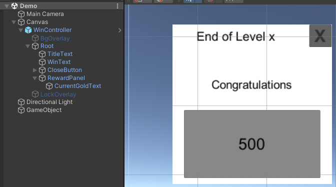
To understand the process better, assume that we are trying to create an Animated Win Popup that shows us the followings;
- A "Congratulations" Text that fades in.
- An Animated Panel that contains the coin amount we win in that level.
- An Animated Close Button.
- Inanimate Title Text.
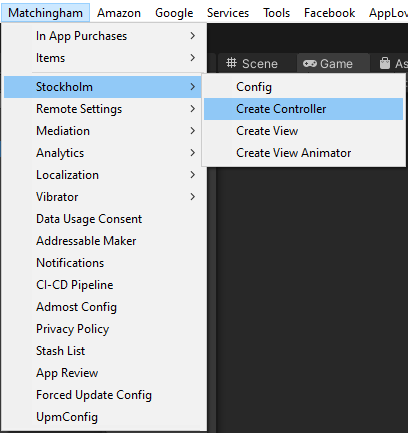
First, click on Matchingham > Stockholm > Create Controller menu. This will open a Create Controller Menu.
In this menu, you may create a Controller script alone, or you may choose to add View and Model to your controller.
For now let's assume we want to have all three together:
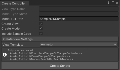
As you can see Controller, View and Model are all script components and they will be created as described below in the menu. For name, we can put in anything (prefarably in Pascal-Case, but must be in English characters). These scripts are created in predestined paths, and later they are searched in these paths as well, so it is best to not move them later. These predestined paths can be edited in configuration, please refer to Stockholm Configuration for more information. For now let's put Win/Win for name, this means we want to create WinController.cs, WinView.cs and WinModel.cs scripts inside Win directories.
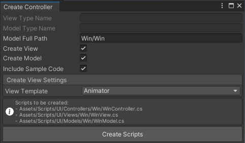
Now, since we want our Popup Animated, we are going to need an animated view. In View Templates dropdown, you can select one of the templates to be used easily.
- DoTween : DoTween animation (requires Stockholm Tween Extension to be present).
- Scaled (Linear) : Animation changing the scale of UI element from Vector2.zero to Vector2.one linearly in a given duration.
- Scaled (AnimationCurve) : Animation changing the scale of UI element according to the data in AnimationCurve component attached in a given duration.
- Faded (Linear) : Animation changing the opacity of UI (Image) element from Vector2.zero to Vector2.one linearly in a given duration.
- Faded (AnimationCurve) : Animation changing the opacity of UI (Image) element according to the data in AnimationCurve component attached in a given duration.
- Animator : Uses Animation component attached to the UI element.
- Empty : Empty View. This just enables and disables the UI. i.e. no animation.
We select Animator from templates.
When we click Create Scripts it creates the scripts in mentioned paths. In case there is already a script with the same name in any of the paths, there is additional popup which informs you if you would like to overwrite them. We advise not to overwrite anything if you are not sure.
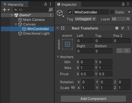
After scripts are created you can simply add controller as component to your Canvas object.
-
Create WinController object in hierarchy.
-
Make sure the object is stretched to both sides with zero space as in below.
-
Add
WinControllercomponent to your gameobject. -
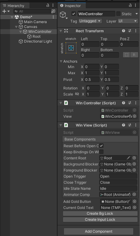
Observe the rest (Creation of root object, addition of View script etc) is handled by the automated scripts.
-
After then it is just the job of adding the rest of the UI under
Root.
Under View, there are two additional settings that is common to all Views:
- Create Bg Lock : Bg Lock on the other hand is a background overlay which can be used to block access to what is behind of our User Control.
- Create Input Lock : This is a front overlay which can be used to block access to our user control when animation is in place for example.
Ideally both of them should be selected if it is a popup, but for inanimate user control like ObjectiveBar, you may choose to leave them deactivated.
The structure of a certain User Control comprises of a GameObject at the top which contains Controller and View components, and a child root which contains everything except InputLock (LockOverlay) and BgLock (BgOverlay). In other words, we have to put sub UI elements under root object.
Let's recall what we had to do from previous chapter, and create them one by one.
A "Congratulations" Text that fades in:
- Right Click on Root object.
- Select
UI > Legacy > Textfrom the menu. (The type of text object is not important) - Click
Add Componentfrom Inspector window. SelectStandalone Faded View. - Change the name to "WinText" and inside Text Component, write "Congratulations".
An Animated Panel that contains the coin information we win in that level:
- Right Click on Root object.
- Select
Create Empty Objectfrom the menu. - Add
Standalone Animated Viewcomponent. Observe a Root transform is created with a default Animator component. We advise and designed View components to be created with a root object where it makes sense. Since we will animate the panel, it should be anchored to a parent object. Faded View above do not need a root object, so it doesn't create one. You can delete the root and assign theContent Rootof the View component to be itself. - Add Image object to the Root, update color.
- Change the main object's name to RewardPanel.
- We are not done yet because we want this panel to contain another text of how much coin we have. To do that, just add a regular Text UI. Since it is not going to be animated, we do not need View component here.
- Name the Text UI as "CurrentGoldText".
An Animated Close Button that is shown after all other animations completed:
- Right Click on Root object.
- Select
UI > Buttonfrom the menu. - Add
Standalone Animated Viewcomponent. - Change the name to CloseButton.
That is it. We are almost done. The last element in our TODO list is Inanimate Title Text. Again, we do not need any animation for this element, so regular Text UI should do the trick.
After arranging their sizes and places, it becomes something like this:
Observe that everything except the overlays are under Root gameobject. If you take a look at the Inspector window, under Win View you will see the fields under Base Components header. WinView is an inherited class which manages the popup animation as a base functionality. Depending on the View template you choose, you will see different type of settings here. And they come with predefined parameters and references to assets which are also created if there is a need.
So far we just created WinController . To be able to load and instantiate it in our game we are going to need a prefab. For that, just drag and drop the WinController object onto the Project window. If the location is under Resources folder, we can easily load it through Stockholm features.
(!) To use created UIs dynamically, they should stay under any Resources/Stockholm folders, Stockholm searches these prefabs under this path.
After WinController in hierarchy turned blue indicating it is a reference to a prefab, you can safely delete it from the hierarchy.
Stockholm API Details
As we mentioned in the beginning, we load and unload usercontrols with the help of a singleton component called Stockholm. To utilize it, in initial scene;
- First create a manager script, lets call it UIManager, inherited from Stockholm.cs.
- Create a gameObject and add UIManager as a component.
In Stockholm component, there is only one field Default Root. This is the default location the User Controls would be instantiated on. If we have only one scene in our game, it is preferably best to assign a dedicated canvas for User Controls and reference this canvas in here.
The functionality of Stockholm can be grouped under these two main functions;
Loading and Instantiating UserControls
Mount <TController>(): Loads the selected Controller and instantiates it on default canvas given on.
MountSingle <TController>(): If the controller is already mounted before, returns it. If previously mounted several, returns first found. If none mounted, calls Mount functionality
Example Usage:
WinController win = Stockholm.Instance.Mount<WinController>(string key = "");
// Loads the selected Controller and instantiates it on default canvas given on.
// key: a tag to group controllers
// throws MissingReferenceException if no default root is assigned.
Transform t = ...
WinController win = Stockholm.Instance.Mount<WinController>(Transform t, string key);
// Loads the selected Controller and instantiates it on given transform t, logically a Canvas.
// key: a tag to group controllers
// Alternatively use:
WinController win = t.Mount<TestController>();
Observe that;
- You can use different canvases to instantiate your UserControls.
- You can group these controllers under certain group tag (key) to be referenced conveniently.
- If no key is given, default key is empty string, and you can still reference them with this key.
- If there are more than one scenes in your game, you may not be able to use default canvas for it will be destroyed in scene change.
Mount <TController>(string name): Uses the given prefab name to search the controller in Resources.
Mount <TController>(Transform root): Loads the selected Controller and instantiates it on given transform, logically a Canvas.
Mount <TController>(string name, Transform root)
MountSingle <TController>(string name)
MountSingle <TController>(Transform root)
MountSingle <TController>(string name, Transform root)
Unloading UserControls
Unmount<TController>(): Removes and destroys all controller instances of a given type
Unmount(string name): Removes and destroys all controller instances of a given name (the name used to load it)
Unmount(Controller instance): Removes the preloaded controller instance, destroying it.
Example Usage:
WinController win = ...
Stockholm.Instance.Unmount(win);
// Removes the preloaded controller instance, destroying it.
Stockholm.Instance.Unmount(string key);
// Removes and destroys all controller instances grouped with a certain key.
// Alternatively use:
WinController win = ...
win.Unmount();
Stockholm.Instance.Unmount<TController>();
// Removes and destroys all controller instances of a given controller type
Observe that;
-
You can destroy certain controller and its gameobject through unmounting, even if it is not created with Stockholm.
-
You can destroy all controller instances with key or type, if there is any created under that key or type.
-
To unmount everything, you can just use;
Stockholm.Instance.Unmount<Controller>();since they are all derived from Controller class.
Utility Functions
-
TryGetWithKey
bool TryGetWithKey(string key, out List<Controller> result);Tries to find all controllers grouped under certain group key.
-
TryGetWithType
bool TryGetWithType<TController>(out List<TController> result) where TController : Controller;Tries to find all controllers of certain controller type
-
IsAny
bool IsAny();Checks if there is any controller
-
IsAny(string
bool IsAny(string key);Checks if there is any controller with given key.
-
FindFirst
TController FindFirst<TController>() where TController : Controller;Returns the first controller instance
-
FindAll
List<TController> FindAll<TController>() where TController : Controller;Returns all controller instances of a specified type
-
TryGetKey
bool TryGetKey(Controller controller, out string key);Tries to find the key of given controller
-
GroupUnderKey
void GroupUnderKey(Controller controller, string key);Changes the controller key to another key if controller exists.
Controller Details
Controllers are supposed to keep action definitions and they are used as a main component in a UserController.
Initialize: Initializes the controller
AddHandlers: Register your actions here
HandleAction: Registers an ActionHandler with a given name
InvokeAction: Invokes the action with a given parameters
ResetController: Resets the view back to the initial condition
Open: Opens the view
Close: Closes the view

View Details
Views are all about the opening and closing a certain user control or element. They can be used alone, if methods are accessed someone of course, yet we encourage it to be used in MVC Framework as described in documentation.
OnOpenBegin: Event thrown when the Open animation begins
OnOpenEnd: Event thrown when the Open animation ends
OnCloseBegin: Event thrown when the Close animation begins
OnCloseEnd: Event thrown when the Close animation ends
(!) Subscribe to above events to program actions synchronized with animation.
IsAnimating: Returns if open or close animation is playing.
IsOpen: Returns if View fully open.
ResetView: Resets the view back to the initial condition
Open: Opens the view
Close: Closes the view
Bind: Add listeners for reflective properties here. This is model bound method.
Unbind: Remove listeners from reflective properties here. This is model bound method.
View Types
Animator View
Here is an example of what inspector looks like with a view created by animator template.
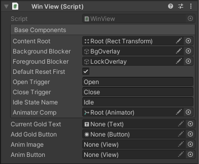
-
Content Root, Background Blocker and Foreground Blocker are explained in section How to Create an Animated Popup (UserControl)
-
Default Reset First: If checked, it resets the animation everytime it opens the animation.
-
Open Trigger: Trigger parameter which used to trigger change from Idle state to Open state.
-
Close Trigger: Trigger parameter which used to trigger change from Open state to Close state.
-
Idle State Name: State name of Idle state.
-
Animator Comp: Reference to the animator component which is located on root.
Observe that we designed it to have a specific Animator State Machine which can be used in this type of View.
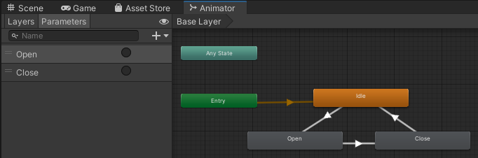
This animator can be arranged to have additional states to accommodate the game's needs. However, the basic state machine should follow the rules of;
- Transition from Idle to Open should be with "Open Trigger".
- Transition from Open to Close should be with "Close Trigger".
- After Close animation completed, it should go and stay at the "Idle" state.
If animator template is used, we have a sample animation controller which we automatically reference. To create a sample animation controller of your own, you can use
Create Sample Animationwhich can be accessed in project window onCreate > Matchingham > MG Stockholm > Create View Animation. Later on, you can easily adapt this controller for your game's needs, i.e. just change the animations referred by Open and Close states.Important: Animation controller provided by this API contains StateMachineBehaviour scripts attached to Open and Close states. Any other animation controllers without proper OpenBehaviour(.cs) and CloseBehaviour(.cs) components, would not be able to produce correct events.
Scaled Linear View
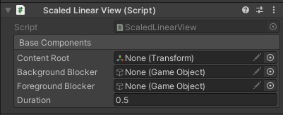
- Open command scales content root transform from Vector2.zero to Vector2.one in given "Duration".
- Close command scales content root transform from Vector2.one to Vector2.zero in same duration. In this example it is .5 seconds.
- If no root is defined, it uses the transform this component attached.
Scaled Animation Curve View
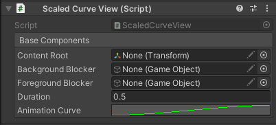
- This view additionally uses an Animation Curve component to decide how animation acts when opening up and closing down.
- In Animation Curve, you can define the scale in between [0, 1] time scale. The data outside the [0, 1] time interval is obsolete.
- Observe that this view still uses Duration component which is the total time it takes for animation.
Faded Linear View
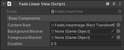
- Open command fades content root image from transparent to opaque in given "Duration".
- Close command fades content root image from transparent to opaque in same duration. In this example it is .5 seconds.
- If no root is defined, it uses the transform this component attached.
Faded Animation Curve View
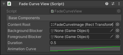
- This view additionally uses an Animation Curve component to decide how animation acts when opening up and closing down.
- In Animation Curve, you can define the scale in between [0, 1] time scale. The data outside the [0, 1] time interval is obsolete.
- Observe that this view still uses Duration component which is the total time it takes for animation.
Empty View
Empty view does not use any animation, and just enables and disables view in Open and Close.
Model Details
Reflective properties related to model definition comes here. Also some localization functionality should be introduced in game cycle.
Code Samples
There is a Demo.unity scene under Runtime > Samples.